Svea
At Svea, I worked on several projects in several teams. I collaborated closely with the UX/UI designers on each project.
Here, I’ll show you some examples of what we created.
Svea Pay
At Svea, I was part of a team developing the MVP flows for a new app, Svea Pay. In the app, users can gather and pay all their invoices connected to Svea’s payment service.
In this project, I worked closely with two UX designers. We created all the different flows together, from brainstorming, research, mapping the user journey, wireframes, and user testing to delivering the final design. We had a lot of stakeholders from different parts of Svea and their needs to take into consideration. It was vital that our product, the Svea Pay app, aligned with all parts of Svea and all relevant Svea products. To ensure everyone was on board we had walkthroughs with them at different stages of the design process. We also cooperated a lot with the developers to discuss functionality and solutions, and we also had regular syncs and demos with them.
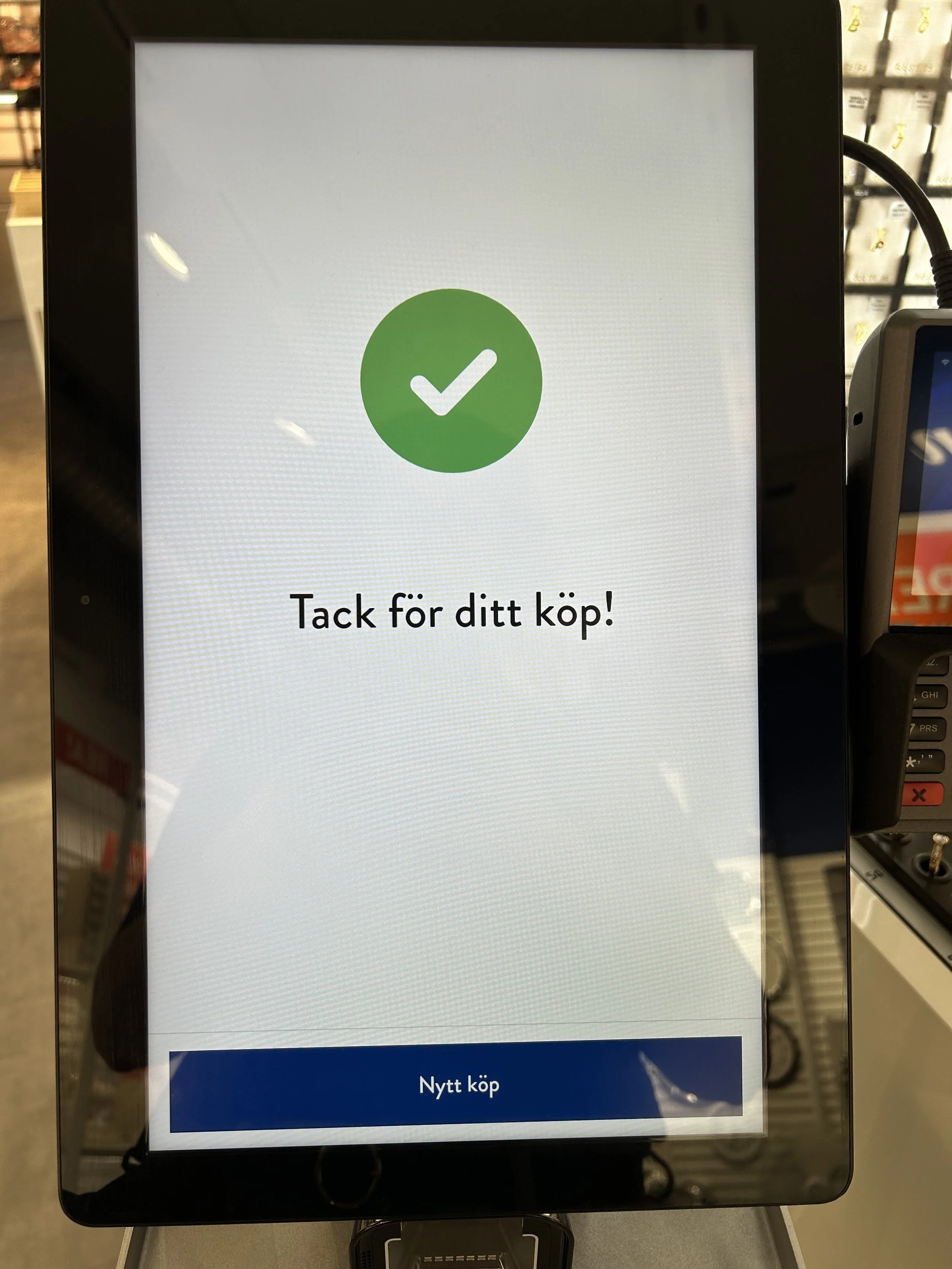
Part of the payment flow for Svea Pay
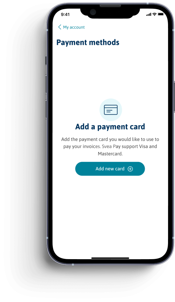
Add your payment card
Payment methods. Before the user can pay the invoice they need to add a payment card. This screen will only show if the user does not have a saved payment card in their account.
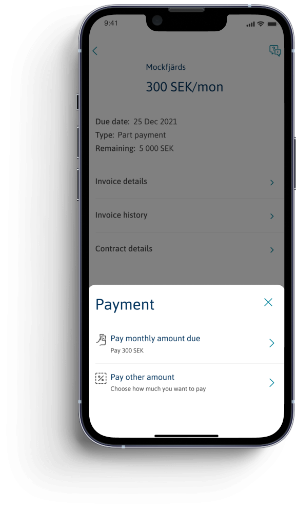
Select payment option
The user has the option to either pay the whole invoice amount or pay any amount they want to – from the lowest possible amount to the whole invoice or installment plan.
This option is called “Pay less” in other Svea products. I decided to go against that since the user actually has the option to pay less – or more.
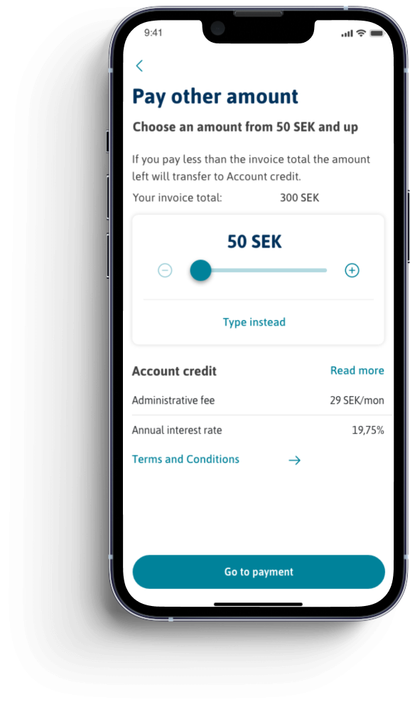
Choose how much to pay
If selecting “Pay other amount” the user get to choose how much they want to pay. The screen tells them the lowest amount and how much the amount due is. It also tells them that their installment plan, or the rest of the invoice amount, will transfer to an Account credit If they decide to pay less than the amount due.
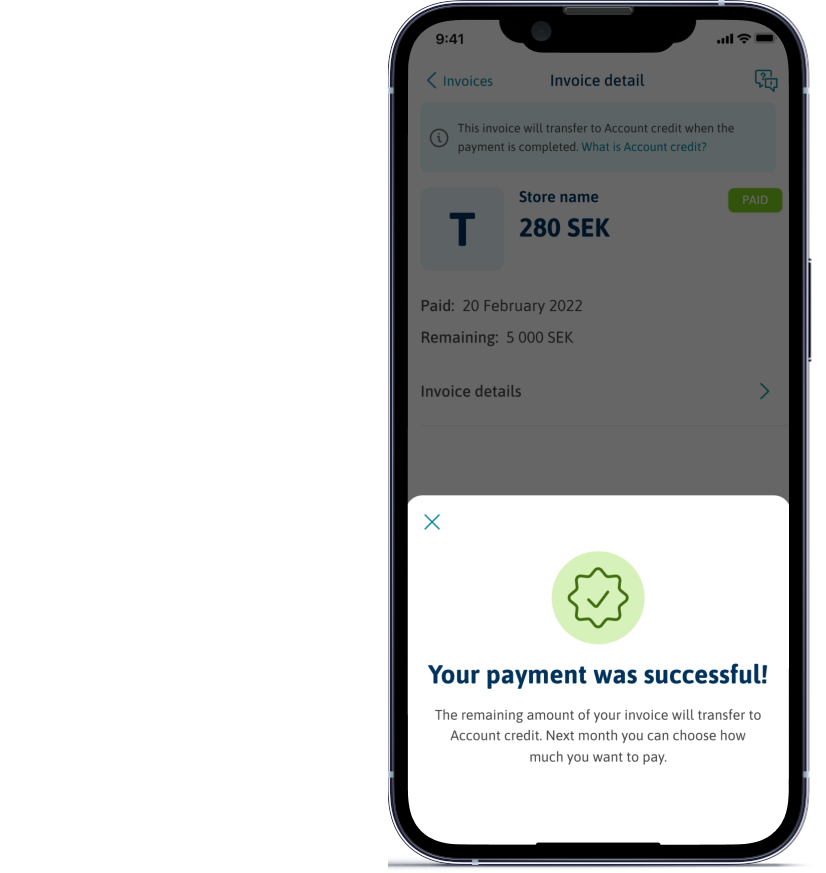
Confirmation
After confirming the payment the user gets a confirmation. The confirmation tells them, again, that what remains of their invoice or installment plan will be transferred to an Account credit.
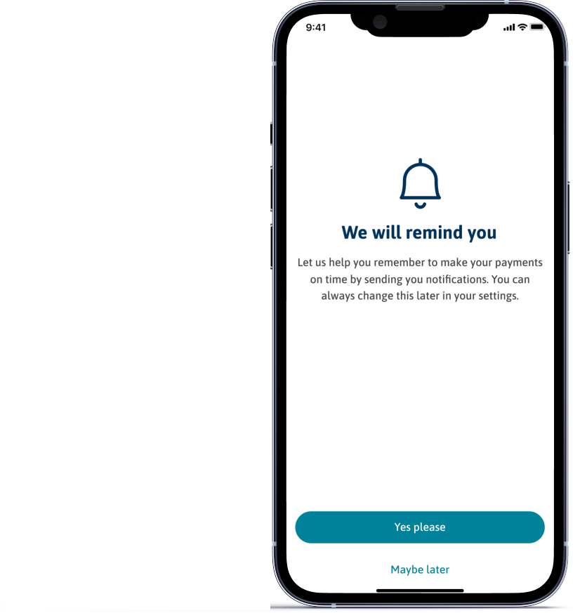
Notifications
This is the onboarding screen for notifications, a screen that shows the first time you log in that lets you opt-in or -out of receiving notifications.
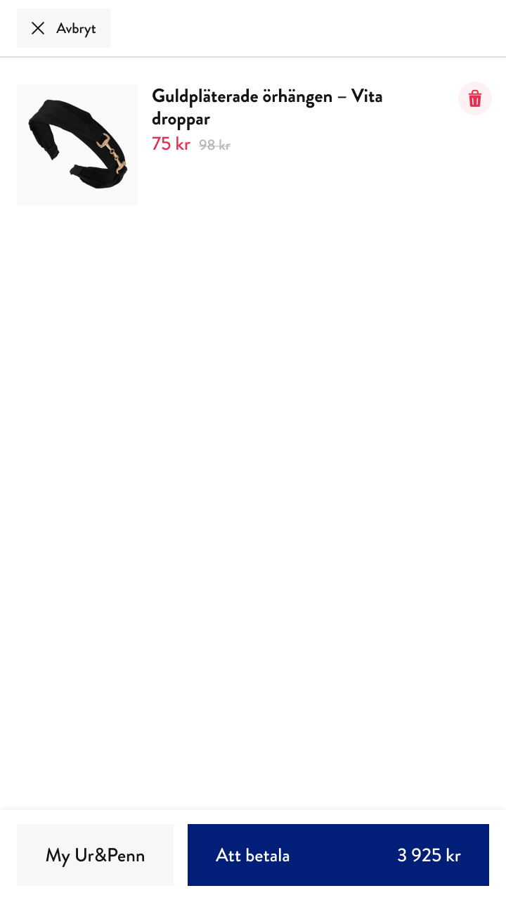
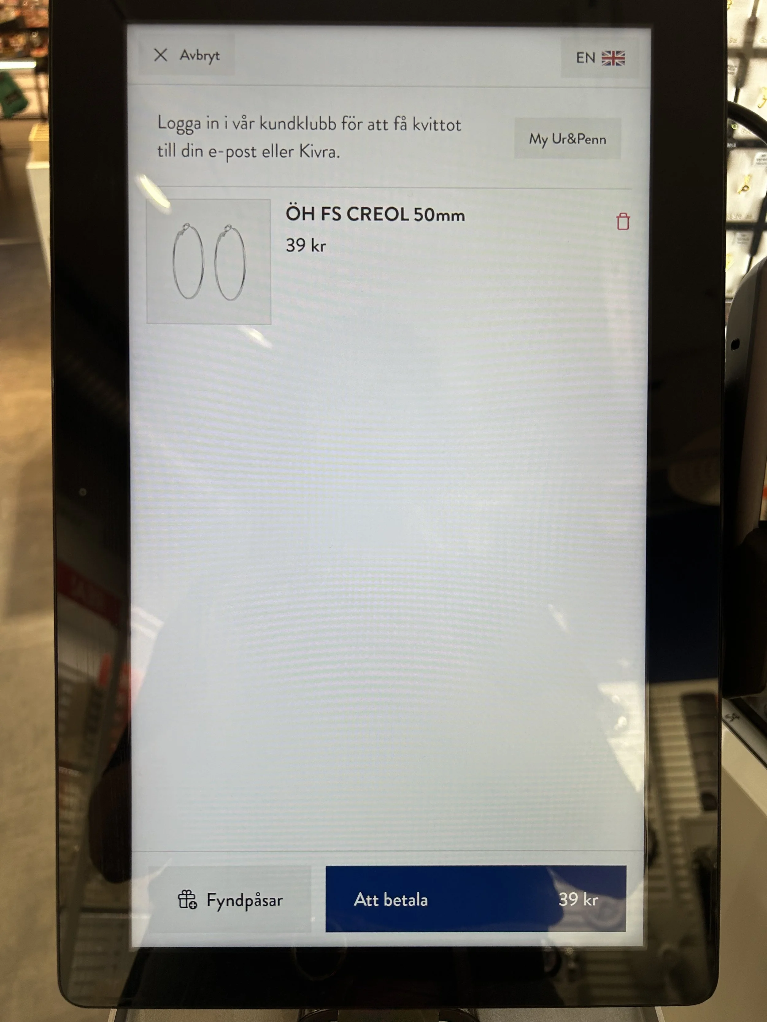
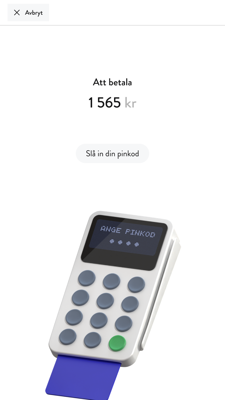
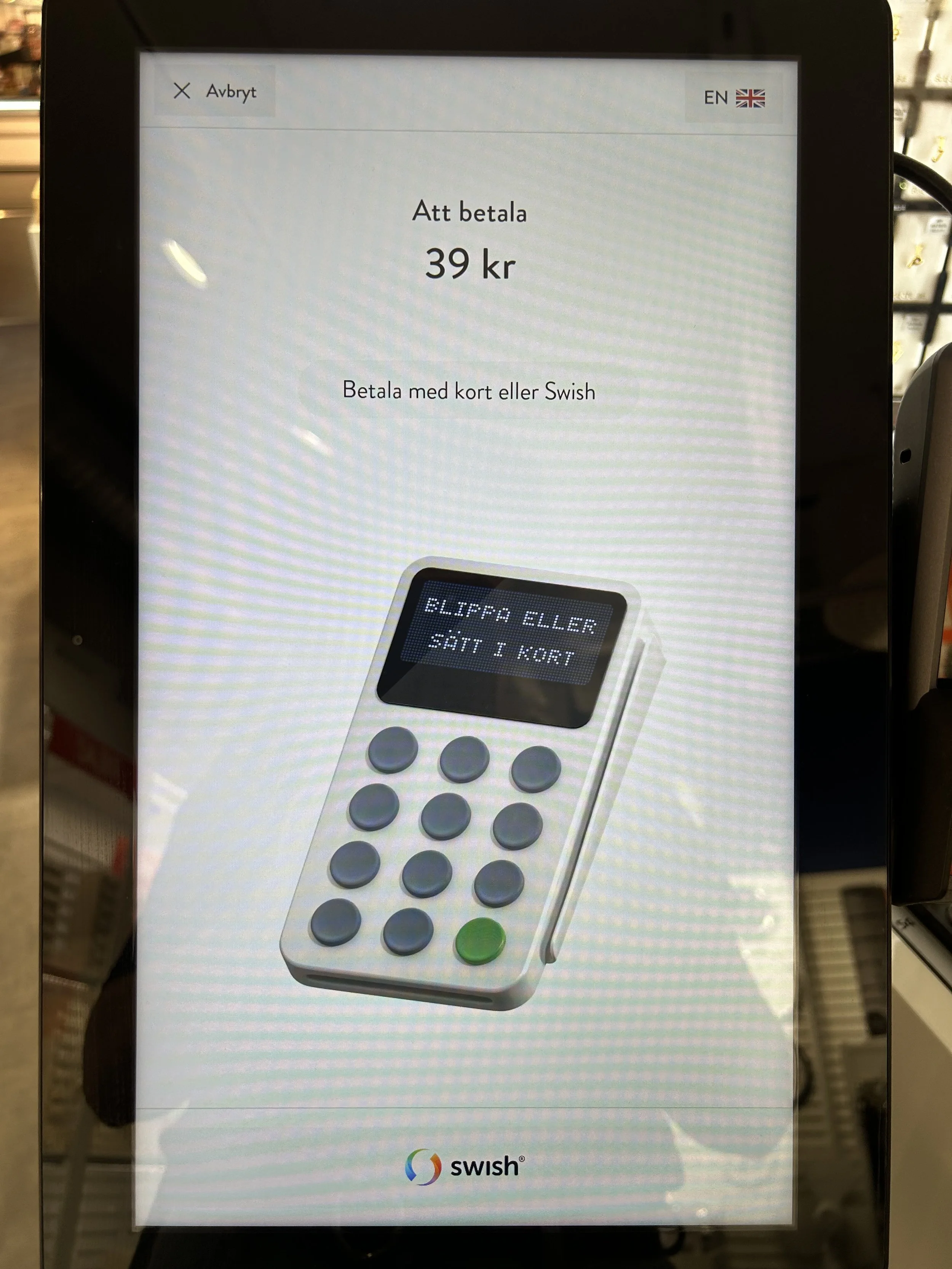
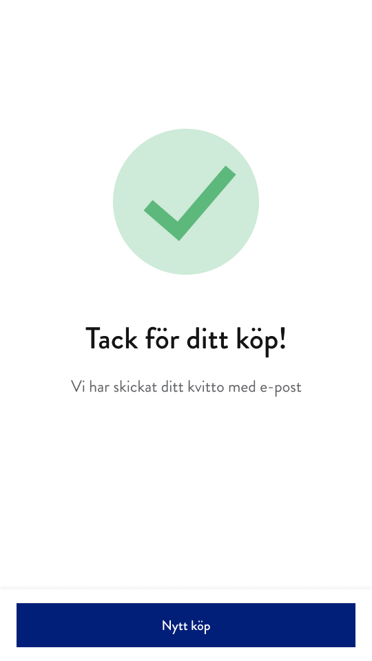
Ur& Penn cashier, MVP
During my time at Svea, we had the opportunity to create a self-service cashier for the Swedish store Ur&Penn. I worked closely with a UX designer and several developers on this project. Today, you can find our work in many Ur&Penn stores across Sweden.
Throughout this project, we did a lot of iterations and tried to improve the cashier by gathering knowledge from staff working in the Ur&Penn stores. I also looked at other self-service cashiers to try and find some common ground – these are typically screens where you want the user to recognize and know the expected behavior.
The top row is our MVP, and to the bottom is what it looks like live in stores today.
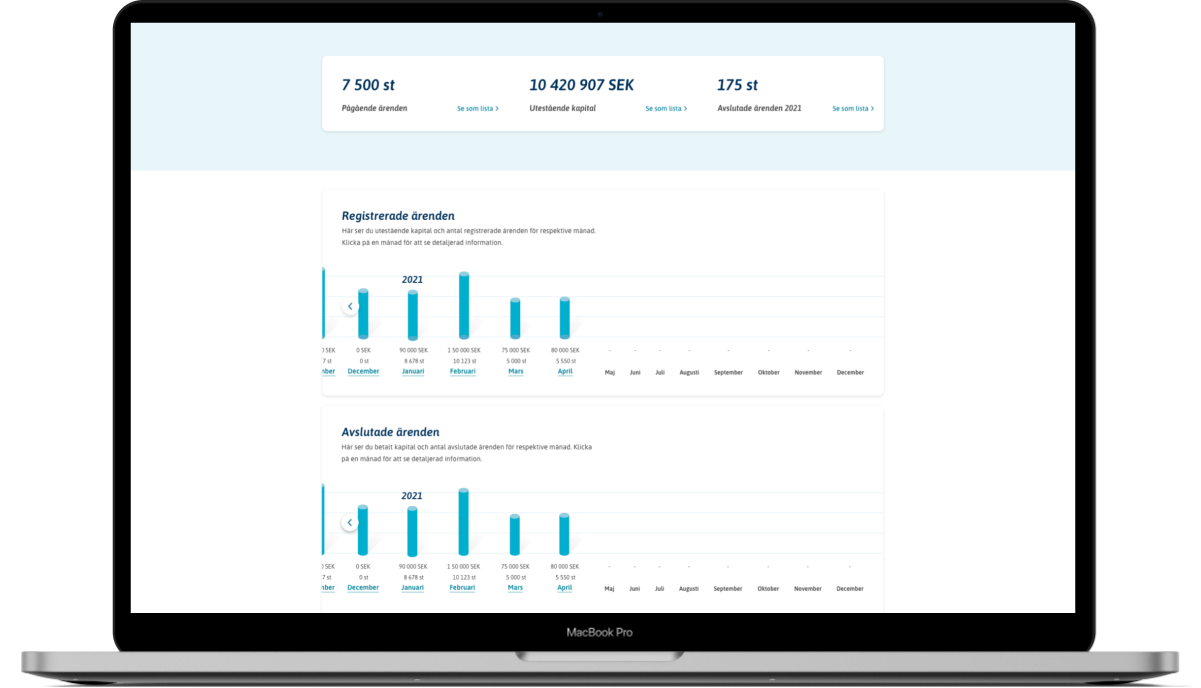
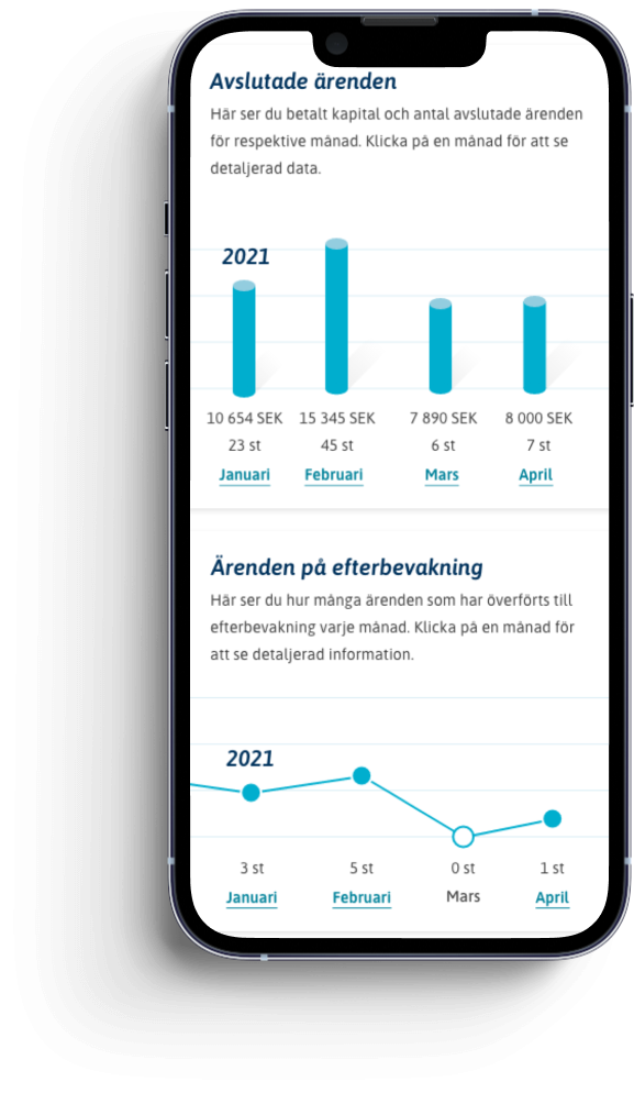
Svea Inkasso
During spring 2021 I worked on renewing and redesigning the pages for statistics and reports at Svea debt collection. This was the first project I was involved in at Svea. Svea Inkasso uses Swedish copy.
These pages are part of the customer’s account at Svea debt collection, where the users can see data and statistics on their cases and clients (debtors). The end-user, the debtor, does not have access to these pages.
Me and a designer mapped out all the different parts, interviewed a few of our customers, and researched what was most used and most important to see first for the users. We also had to understand how everything was connected – which wasn’t easy to get a grip on. The old “design” wasn’t designed at all. It was just old messy charts full of data. It was very hard to understand how to find the data you wanted to see.
Eventually, we were able to restructure and redesign everything. We ended up creating an overview of commonly used statistics and numbers, like registered cases month by month, and the number of ongoing and closed cases. We also did different charts where the clients themselves can filter out the data they want to see. Hopefully, the data will show that we made it easier for the customers to use more of the different data options.